An embeddable React layer for turning visual annotations into AI-readable data. SketchLayer provides a high-DPI Canvas 2D renderer, pointer input, semantic colors, immutable undo/redo history, and versioned JSON export—without becoming a general-purpose whiteboard.
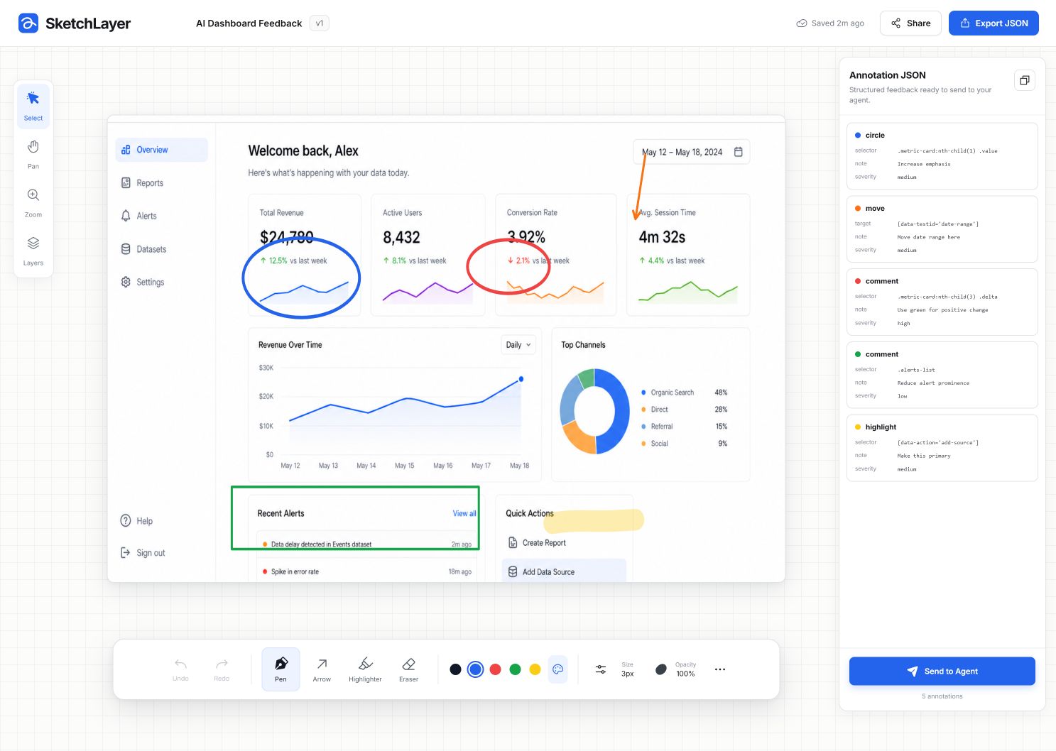
Use SketchLayer when a React product needs people to mark up an AI-generated interface, then send an agent structured visual feedback such as “move this higher” or “preserve this”. It is designed to sit over an existing UI or image, not replace it.
It is not a collaborative whiteboard, Figma-style editor, document editor, or social-graphic creator. Text tools, object transforms, collaboration, and a full layer tree are intentionally out of scope.
npm install sketchlayer react react-domImport the component styles once:
import "sketchlayer/styles.css";An uncontrolled canvas needs only the component, its styles, and a sized parent:
import { SketchCanvas } from "sketchlayer";
import "sketchlayer/styles.css";

export function FeedbackLayer() {
  return <div style={{ width: 960, height: 540 }}><SketchCanvas tool="pen" brush={{ color: "#111827", size: 4, opacity: 1 }} /></div>;
}
For a complete controlled experience:
import { SketchCanvas, SketchToolbar, useSketchLayer } from "sketchlayer";
import "sketchlayer/styles.css";

export function FeedbackLayer() {
  const sketch = useSketchLayer();

  return (
    <div style={{ width: 960 }}>
      <div style={{ height: 540 }}>
        <SketchCanvas
          value={sketch.value}
          onChange={sketch.onCanvasChange}
          tool={sketch.tool}
          brush={sketch.brush}
        />
      </div>
      <SketchToolbar
        tool={sketch.tool}
        brush={sketch.brush}
        canUndo={sketch.canUndo}
        canRedo={sketch.canRedo}
        canClear={sketch.annotations.length > 0}
        onToolChange={sketch.setTool}
        onBrushChange={sketch.setBrush}
        onUndo={sketch.undo}
        onRedo={sketch.redo}
        onClear={sketch.clear}
      />
    </div>
  );
}Pro annotations keep their visual shape separate from their agent instruction. The agent-ready InstructionMeta payload is small and explicit:
{
  "operation": "move",
  "target": { "kind": "selector", "value": "[data-testid=\"date-range\"]" },
  "note": "Move date range higher",
  "severity": "medium"
}The core package exports:
import {
  SketchCanvas,
  SketchToolbar,
  useSketchLayer,
  exportAnnotations,
  exportCanvasPng,
  serializeDocument,
  deserializeDocument,
} from "sketchlayer";SketchCanvasaccepts either uncontrolled props or a controlledCanvasValue/onChangepair.useSketchLayerowns immutable history, semantic brush state, tools, and JSON export helpers.SketchToolbaris optional; its props are deliberately controlled so it can be replaced by a product-specific UI.exportAnnotationsproduces the versioned JSON document;exportCanvasPngproduces a transparent PNG data URL.
See the API reference, runnable examples, publishing guide, and validation protocol.
The Pro entry adds AI shapes, accessible color controls, natural freehand strokes, and structured instruction editing without increasing the core entry bundle. This complete composition is also available as examples/ProAnnotation.tsx.
import { useState } from "react";
import { colorTemplates, SketchCanvas, type ColorTemplate } from "sketchlayer";
import {
  AnnotationInspector,
  BrushStudio,
  ColorStudio,
  ProToolbar,
  ShapeStudio,
  useProSketchLayer,
} from "sketchlayer/pro";
import "sketchlayer/styles.css";
import "sketchlayer/pro.css";

export function ProAnnotation() {
  const [templates, setTemplates] = useState<ColorTemplate[]>(colorTemplates);
  const pro = useProSketchLayer({
    resolveTarget: ({ anchor }) => ({ kind: "region", id: `canvas-${Math.round(anchor.x)}-${Math.round(anchor.y)}` }),
  });

  return (
    <div style={{ width: 960 }}>
      <div style={{ height: 540 }}>
        <SketchCanvas
          value={pro.value}
          onChange={pro.onCanvasChange}
          tool={pro.tool}
          brush={pro.canvasBrush}
          selectedAnnotationId={pro.selectedAnnotationId}
          onAnnotationSelect={pro.selectAnnotation}
        />
      </div>
      <ProToolbar
        tool={pro.tool}
        activePanel={pro.activePanel}
        canSend={pro.canSend}
        onToolChange={pro.setTool}
        onPanelChange={pro.setActivePanel}
      />
      {pro.activePanel === "draw" && <BrushStudio value={pro.brush} onChange={pro.setBrush} />}
      {pro.activePanel === "shape" && <ShapeStudio value={pro.activeShapePresetId} onChange={pro.selectShapePreset} />}
      {pro.activePanel === "color" && <ColorStudio value={pro.brush} templates={templates} onChange={pro.setBrush} onTemplatesChange={setTemplates} />}
      {pro.inspectorDraft && <AnnotationInspector value={pro.inspectorDraft} resolverStatus={pro.resolverStatus} isNew={pro.isInspectorNew} onChange={pro.setInspectorDraft} onSave={pro.saveInspector} onCancel={pro.cancelInspector} />}
    </div>
  );
}templates, brandPalette, and onTemplatesChange are controlled by the host; SketchLayer never writes them to local storage. There is no public hosted demo yet, so the repository example is the canonical source instead of a browser-local route.
- Peer dependencies: React and React DOM
^18.3.0 || ^19.0.0; TypeScript declarations are bundled. - For SSR frameworks, render
SketchCanvasfrom a client component. Canvas 2D and Pointer Events become interactive after client hydration. - Core is 6.47 KB gzip; the optional Pro consumer bundle is 43.21 KB gzip (minified ESM gzip, excluding React and React DOM peers).
- SketchLayer targets modern browsers with Canvas 2D, Pointer Events, ResizeObserver, and ES2022 support. For older browsers, load polyfills in the host application.
npm install
npm run dev
npm run typecheck
npm test
npm run build
npm run package:check
npm run package:check builds the library and validates the package contents with npm pack --dry-run. Run npm run test:e2e separately when Playwright browsers are installed.
Before publishing a new package version, run the commands above, then follow the publishing guide.
MIT