-
-
Notifications
You must be signed in to change notification settings - Fork 5
SF-3665 Improve dark theme #3637
New issue
Have a question about this project? Sign up for a free GitHub account to open an issue and contact its maintainers and the community.
By clicking “Sign up for GitHub”, you agree to our terms of service and privacy statement. We’ll occasionally send you account related emails.
Already on GitHub? Sign in to your account
base: master
Are you sure you want to change the base?
Conversation
Codecov Report✅ All modified and coverable lines are covered by tests. Additional details and impacted files@@ Coverage Diff @@
## master #3637 +/- ##
==========================================
- Coverage 83.53% 83.53% -0.01%
==========================================
Files 610 610
Lines 37503 37502 -1
Branches 6164 6169 +5
==========================================
- Hits 31328 31327 -1
Misses 5223 5223
Partials 952 952 ☔ View full report in Codecov by Sentry. |
Adds or adjusts coloring for dark theme. Retains light theme colors,
or closely matches them.

Sometimes it wasn't clear how to make something appear in the Lynx
Insights area, to see how it looks.

The index.html "Loading ..." screen now uses a light or dark
background depending on device theme. Note that this is _device_
theme, not the SF setting.

Some of the most significant areas that were improved for dark theme
include
  - Editor pane for target project
  - Red squiggly lines in the editor
  - Audio recording and playback
  - Lynx Insights panel
 RaymondLuong3
left a comment
There was a problem hiding this comment.
Choose a reason for hiding this comment
The reason will be displayed to describe this comment to others. Learn more.
This is looking really good. For the major components like the lynx insight panel and the scripture editor this is a huge improvement. I didn't notice many issues but I noted a few. I am sure we will want to define a colour palette to choose secondary and accent colours eventually, but this is a nice step for dark theme.
@RaymondLuong3 reviewed 55 files and all commit messages, and made 5 comments.
Reviewable status: all files reviewed, 4 unresolved discussions (waiting on @marksvc).
src/SIL.XForge.Scripture/ClientApp/src/index.html line 27 at r1 (raw file):
    <link rel="manifest" href="manifest.json" />
    <meta name="theme-color" content="#343a31" />
    <style>
This seems like a strange place to be defining css rules but I see that this is outside of our angular app.
src/SIL.XForge.Scripture/ClientApp/src/app/translate/editor/lynx/insights/_lynx-insights.scss line 29 at r1 (raw file):
  --lynx-insights-status-indicator-bg-color: #fff;
  --lynx-insights-status-indicator-offset: 19px;
Why was this removed and hard code it into the component scss rule?
Code quote:
--lynx-insights-status-indicator-offset: 19px;src/SIL.XForge.Scripture/ClientApp/src/app/translate/translate-overview/_translate-overview-theme.scss line 14 at r1 (raw file):
    )};
  // The donut background functions both as a background color for the circle as well as an inside and outside edge
  // color.
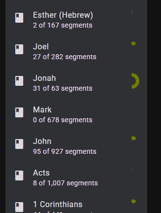
The progress track should be updated in dark theme. It is hard to see the progress track.
src/SIL.XForge.Scripture/ClientApp/src/_text.scss line 12 at r1 (raw file):
@mixin color($theme) {
  $is-dark: mat.get-theme-type($theme) == dark;
Is there a way to get the cursor to be a different color. When typing in the editor I cannot see the cursor at all because the cursor is black.

Adds or adjusts coloring for dark theme. Retains light theme colors,
or closely match them.
Sometimes it wasn't clear how to make something appear in the Lynx
Insights area, to see how it looks.
The index.html "Loading ..." screen now uses a light or dark
background depending on device theme. Note that this is device
theme, not the SF setting.
Some of the most significant areas that were improved for dark theme
include
I have been developing on top of some local dark mode changes for a couple months. This PR proposes an improvement of those changes, and takes care not to disrupt anything in light mode.
As I learn about Angular and Material theming over time, I increasingly see that there is room for simplifying and reducing hard-coding of our application's colouring. This PR is not that improvement :). Neither does this PR make dark theme perfect, but it makes it easier to work with when testing and developing the application.
Screenshot showing editor:

This change is