Skip to content

fix(web): keep narrow conversation content crisp - #394

Open
testikun wants to merge 1 commit into
openpi-dev:mainfrom
testikun:codex/issue-393-narrow-blur
Open

fix(web): keep narrow conversation content crisp#394
testikun wants to merge 1 commit into
openpi-dev:mainfrom
testikun:codex/issue-393-narrow-blur

Conversation

@testikun

@testikun testikun commented Sep 4, 2026

Copy link
Copy Markdown
Contributor

Problem

Fixes #393.

At widths of 760px or less, the responsive .workbench-header becomes an absolute full-shell overlay but retains the desktop backdrop-filter. That blurs the complete conversation, message list, and composer when a user drags the window into the mobile layout.

Value

The Web workbench remains readable and usable while resizing between desktop and narrow layouts. The mobile sidebar trigger still stays available without obscuring the conversation.

Approach

  • Reset both the standard and WebKit backdrop filters on the narrow full-shell header.
  • Preserve the desktop header blur declaration and all existing mobile positioning and pointer-event behavior.
  • Add a static-resource regression assertion that binds the reset to the narrow responsive rule.

Validation

  • node --test --experimental-strip-types tests/web/web-host.test.ts: 19 passed.
  • bun run check: passed.
  • bun run test: Node 1241 passed, 1 skipped; Vitest 30 passed.
  • Runtime provenance: checkout ad74a4b; local pi list reports no installed packages, and the Web Host was launched directly from this checkout through bin/openpi.js on Node 22.
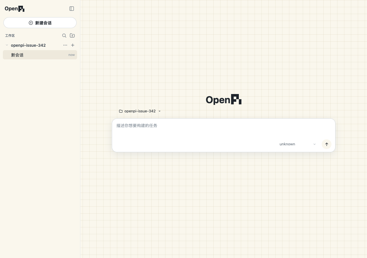
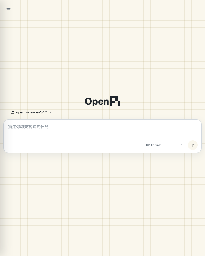
  • Real UI smoke: loaded the same local Web Host in Chrome at 1280x900 and 720x900. At 720px the mobile sidebar trigger is visible and the logo, workspace picker, reference grid, and composer remain crisp. Screenshots are attached in the first PR comment.

Impact

  • User-visible behavior: narrow Web layouts no longer blur the conversation.
  • Model-visible context or tools: none.
  • Runtime or lifecycle: none.
  • Persisted config or data: none.
  • Compatibility and risk: low; the change only overrides inherited visual filtering inside the existing narrow breakpoint.

@testikun

testikun commented Sep 4, 2026

Copy link
Copy Markdown
Contributor Author

Real UI verification

These screenshots come from the actual Web Host launched directly from commit ad74a4b with Node 22. The same runtime was loaded in Chrome at both viewport sizes; no mocked page, provider, or generated image was used.

Desktop · 1280×900 Narrow · 720×900
Real OpenPI desktop verification Real OpenPI narrow verification

At 720px the responsive breakpoint is active: the desktop sidebar is replaced by the mobile trigger, while the reference grid, OpenPI mark, workspace picker, and composer remain crisp. Resizing back to desktop restores the full sidebar without applying a page-wide blur.

@testikun

testikun commented Sep 4, 2026

Copy link
Copy Markdown
Contributor Author

CI context: both Linux Node jobs pass dependency installation, bun run check, bun run test, Pi discovery, and the optional-peer smoke. They fail only when the pre-existing packed standalone Web CLI process exits before announcing its origin (kill: No such process). Windows passes. This matches the independently reproduced fresh-install peer-dependency failure tracked in #328, where npm selects Pi 0.85.0 and @earendil-works/pi-server cannot be resolved: #328 (comment)

This PR changes only responsive CSS plus its static-resource assertion; it does not modify package metadata, CLI startup, or dependency resolution.

Sign up for free to join this conversation on GitHub. Already have an account? Sign in to comment

Labels

None yet

Projects

None yet

Development

Successfully merging this pull request may close these issues.

fix(web): narrow viewport blurs the entire conversation

1 participant