The basic controls
The basic controls included in the AvaloniaColorPicker library are:
- The
ColorPickercontrol, which represents a colour picker. - The
ColorPickerWindow, which is aWindowcontaining aColorPickerand two buttons (OKandCancel) on which the user can click to confirm/cancel their selection. - The
ColorButtoncontrol, which is a button that, when clicked, lets users choose a colour from the last palette they selected.
To use any control in the library, you need to add the xmlns attribute for the AvaloniaColorPicker namespace in the root element of your XAML file, and/or the relevant using directive in your C# code, e.g.:
<Window ...
        xmlns:colorpicker="clr-namespace:AvaloniaColorPicker;assembly=AvaloniaColorPicker"
        ...>
using AvaloniaColorPicker;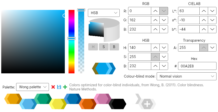
You can simply add a ColorPicker control to your Window (or UserControl, or whatever) using XAML code:
<colorpicker:ColorPicker Color="#56B4E9"></colorpicker:ColorPicker>The ColorPicker control has the following interesting properties and methods:
- The
Colorproperty gets or sets the currently selected colour in the control (this is displayed in the control under "new"). - The
PreviousColorproperty gets or sets the previous selected colour in the control (e.g. if you are using the control to replace a colour, this would contain the color you are replacing). This is displayed in the control under "current". If this isnull, only the currently selected colour is displayed in the control. - The
ColorSpaceproperty gets or sets the color space that is currently selected in the interface (i.e., RGB, HSB or CIELAB). - The static
TransitionsDisabledproperty can be set totrueto disable transitions. This can help avoid some graphical artifacts. This property should be set before any class from the library is instantiated. - The static
ResetDefaultPalettes()method can be used to reset the default palettes. This will restore any deleted default palette, as well as remove any colours added to these palettes by the user. It will not have any effect on custom palettes created by the user.
This control also has additional properties that can be used to hide some elements from the interface and will be discussed later.
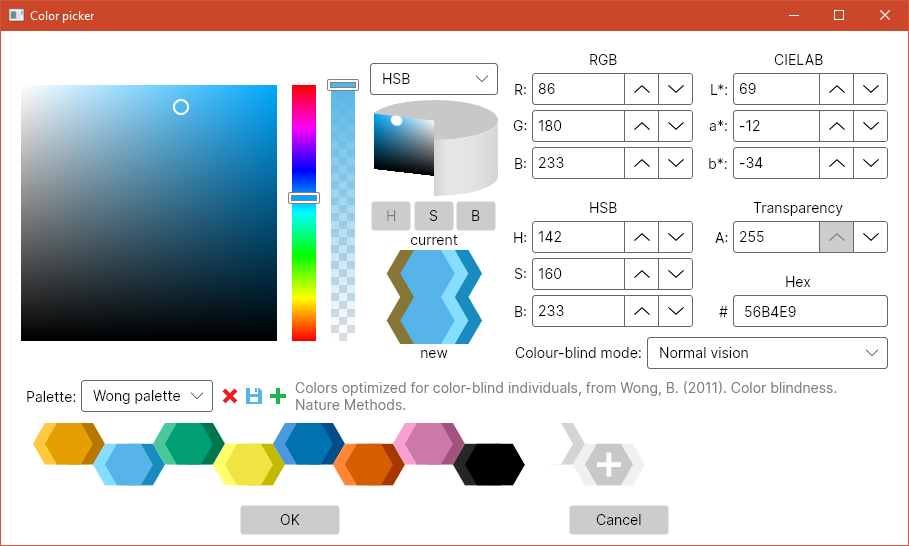
A ColorPickerWindow can be used as a dialog to let the user choose a colour. It has a parameterless constructor, as well as a constructor that takes as an argument a Color that will be used as "previous colour" to initialise the ColorPicker. The Color and PreviousColor properties provide access to the homonimous properties of the underlying ColorPicker. The window can be shown using the asynchronous ShowDialog method. This methods returns a Task<Colour?> that, when awaited, will evaluate to null if the user pressed the Cancel button in the dialog, and to the selected colour if they pressed OK.
The ColorPickerWindow also exposes the same properties to hide interface elements as the ColorPicker control.
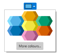
The ColorButton control provides a simple way to show the currently selected colour to the user and to let them change it. When the user clicks on the button, the current palette is shown, as well as a button to open a ColorPickerWindow. If no palette has yet been chosen (e.g. the first time a user clicks on the button after starting the application), or if the current palette is empty, the ColorPickerWindow is shown directly. The selected colour is reflected in the Color property of the ColorButton.
You can add a ColorButton control in your XAML code:
<colorpicker:ColorButton Color="#56B4E9" Name="colorButton"></colorpicker:ColorButton>To be notified of changes in the selected colour, you should subscribe to the PropertyChanged event of the ColorButton, and test whether the changed property is indeed the ColorProperty. For example:
AvaloniaColorPicker.ColorButton button = this.FindControl<AvaloniaColorPicker.ColorButton>("colorButton");
//...
button.PropertyChanged += (s, e) =>
    {
        if (e.Property == AvaloniaColorPicker.ColorButton.ColorProperty)
        {
            //Do something
        }
    };
Please note that this event will fire even when the colour is changed programmatically (i.e. if you set the value of the ColorButton.Color property in your code). The Color property can also be used in Avalonia styles or bindings.