


A standalone, versioned React 19 + Tailwind v4 design system that doesn't shout — every detail quietly considered.
🔗 Live showcase & docs → ui.yuhuanstudio.com
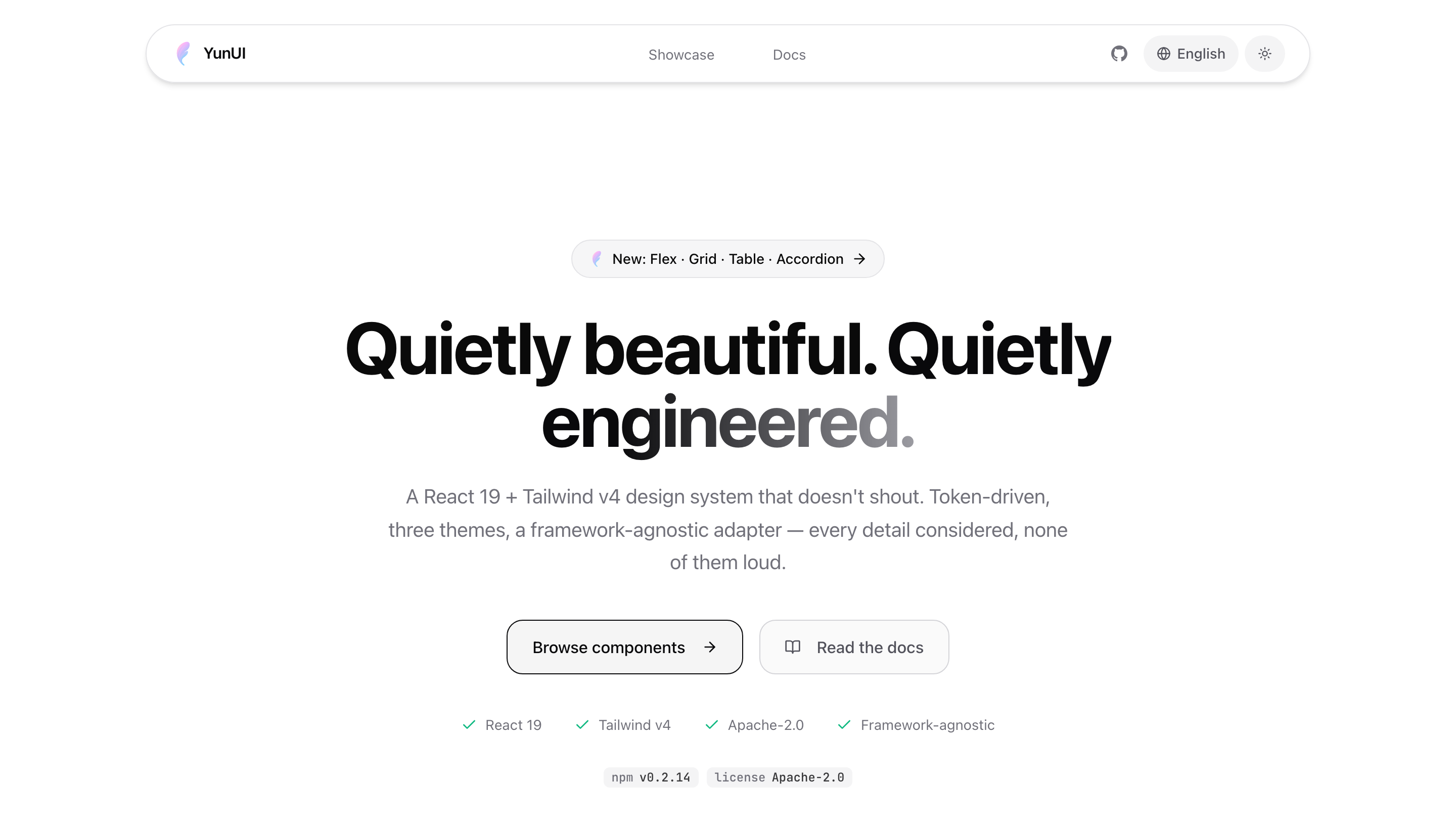
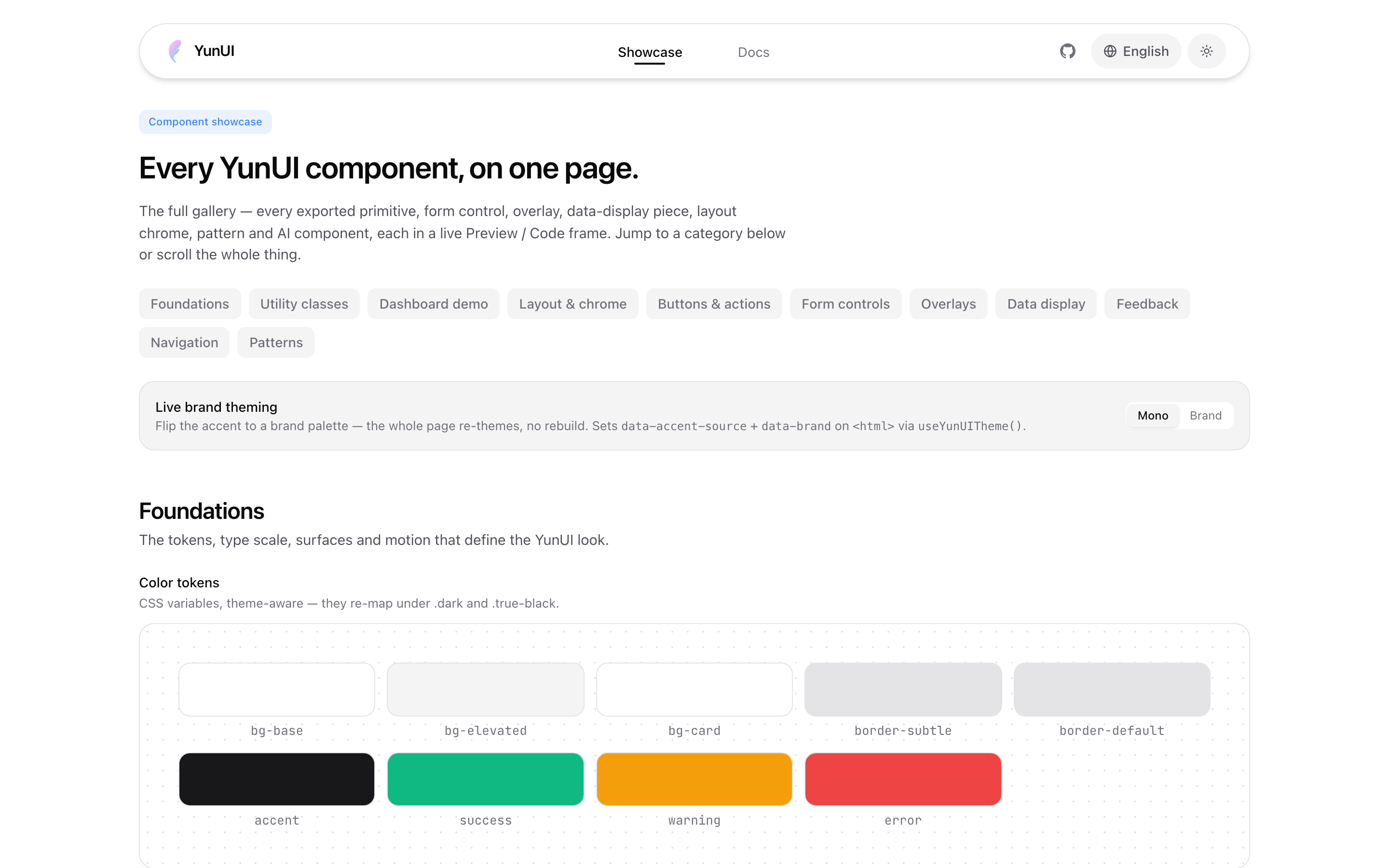
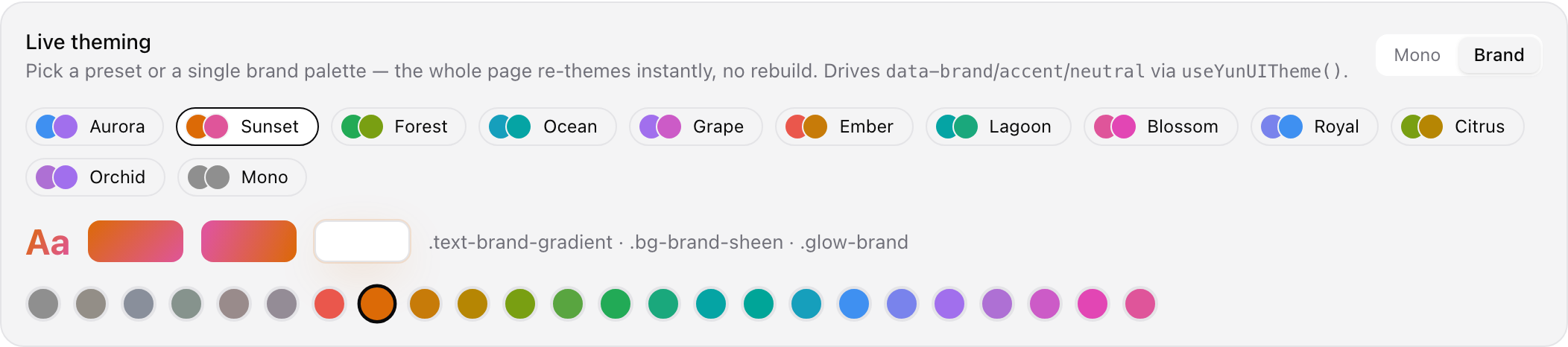
Edit YunUI once → publish a new version → every project picks up the same design tokens, animations, and components on its next upgrade (pnpm up). Already running in production at Yunxin.
YunUI isn't a demo — it ships real products, end to end:
- Yunxin — a unified LLM API gateway aggregating 24+ providers behind one API key. YunUI was extracted from it; every screen runs on these components.
- Yunshu — an open-source, fast, local multimodal inference engine for Apple Silicon (native speech-to-speech, all on-device). Its web UI is built on YunUI.
Building something on YunUI? Open a PR adding it here.
npm i @yuhuanowo/yunui # or pnpm add / yarn addConsumers must be on React 19 and Tailwind CSS v4 (peer dependencies).
Want to keep the import short as
yunui? Use a package alias:Then
import { Button } from "yunui"works — the examples below assume this.
In your global CSS (e.g. app/globals.css):
@import "tailwindcss";
@import "@yuhuanowo/yunui/css";

/* Key step: let Tailwind v4 scan YunUI's compiled output for its inline utility
   classes, otherwise components render unstyled. */
@source "../node_modules/@yuhuanowo/yunui/dist";
The
@sourcepath is relative to that CSS file — adjust it to your project layout. Fonts (Geist / JetBrains Mono) are not bundled; load them yourself in the consuming app.
import { Button, Card, Dialog, DialogContent } from "@yuhuanowo/yunui";

export function Demo() {
  return (
    <Card hover className="p-6">
      <Button variant="primary">Hello YunUI</Button>
    </Card>
  );
}Some components need routing / images / i18n. Inject your framework's implementations once at the root with YunUIProvider:
import { YunUIProvider } from "@yuhuanowo/yunui/adapters";
import Link from "next/link";
import Image from "next/image";
import { useRouter } from "next/navigation";
import { useTranslations } from "next-intl";

<YunUIProvider
  adapters={{
    Link,
    Image,
    useRouter,
    useT: (ns) => useTranslations(ns),
  }}
>
  {children}
</YunUIProvider>;
Without a provider, YunUI uses zero-dependency defaults (<a> / <img> / identity translation).
See ARCHITECTURE.md for the system design — the three layers (core / patterns / app-domain), the design-token system + runtime theming, the adapter pattern, and how to choose among overlapping components.
| Entry | Contents |
|---|---|
@yuhuanowo/yunui |
Atomic components: Button / IconButton / Input / Textarea / PasswordInput / NumberInput / SearchInput / Card / Badge / Kbd / Separator / Alert / Tag / AvatarGroup / StatusIndicator / InlineCode / Steps / Dialog / Select / Slider / Progress / Tabs / Avatar / Tooltip / DropdownMenu / Skeleton / Spinner / PageLoader / EmptyState / Label; layout primitives Flex / Grid / Row / Column / Stack; data display Table / Breadcrumb / Pagination; interactive Accordion / RadioGroup / Switch / Checkbox / Combobox / CustomSelect / SegmentedSelect / NavTabs / Collapsible / Popover / Modal / Sheet / ConfirmModal / ThemeToggle; plus ShinyButton / Marquee / BentoGrid / AnimatedNumber and the MotionDiv · fadeIn · stagger animation presets |
@yuhuanowo/yunui/css |
Design-system stylesheet (token variables, @theme mappings, global .btn / .card / .glass classes, animation keyframes) |
@yuhuanowo/yunui/adapters |
YunUIProvider / useYunUI and the adapter interfaces |
@yuhuanowo/yunui/patterns |
Page-level components: FAQ, StatCard (tone / inline / valueFirst variants), BlogCard, CodeBlock, Sidebar, PageHeader, BackgroundEffects, and more |
@yuhuanowo/yunui/ai |
AI product-domain components (prop-driven, no direct API calls): ProviderIcon / ModelIcon / ModelTypeIcon, ModelCard, CapabilitySelector, Navbar, Footer, LanguageSwitcher, ThinkingBlock, IDBadge, … |
@yuhuanowo/yunui/content |
Content-rendering stack: MarkdownRenderer (GFM + KaTeX + Shiki + Mermaid + callouts + lazy zoomable images), CodeBlock / InlineCode, CalloutBlock, MathRenderer, MermaidDiagram, ContentImage, ImageLightbox. Heavy engines are optional peer deps: Mermaid and Shiki's curated grammar/theme modules load on demand, while unknown code fences fall back to escaped plaintext. Also import @yuhuanowo/yunui/content.css + katex/dist/katex.min.css |
@yuhuanowo/yunui/chat |
Slot-based chat UI blocks (presentational, no data types): ChatMessage, ChatMessageList (stick-to-bottom), ChatComposer, ChatHeader. Pairs with @yuhuanowo/yunui/content |
Utilities / hooks (exported from @yuhuanowo/yunui): cn, toast / Toaster (sonner-based), MotionDiv / MotionSpan / fadeIn / staggerContainer / staggerItem, useEscapeKey / useBodyScrollLock / useModalBehavior.
yunui/aiicon assets ship in the package, separate from the JavaScript bundle, and are served via CDN by default.ProviderIcon/ModelIcon/ModelAvatar/ModelCardresolve/providers/*.pngand/models/*.pngundericonBasePath, which defaults to the package icons on jsDelivr (https://cdn.jsdelivr.net/npm/@yuhuanowo/yunui@0.2/icons) — so icons work with zero setup. To self-host and/or extend with your own icons, copy the package'sicons/(or this repo'ssite/public/icons/) into your app and point the adapter at it:<YunUIProvider adapters={{ iconBasePath: "/icons" }}>. A single custom icon URL can be passed via a component'siconUrlprop and is used as-is. next/image users: self-host, or allowcdn.jsdelivr.netinimages.remotePatterns.Likewise,
./_deferred/ai-search(the docs AI search) is not exported — it is bound to@ai-sdk/react+ a chat stack, making it a product feature rather than a general component; exporting it would force an ai-sdk peer dependency on the library.
MarkdownRenderer accepts optional linkOrigin to classify same-origin absolute links consistently during SSR and in the browser. Without it, absolute HTTP(S) and protocol-relative links are external, while relative links stay internal. ImageLightbox accepts an optional accessible label (defaults to the image alt text or the content translation); it traps focus, exposes a modal dialog, and locks background scrolling.
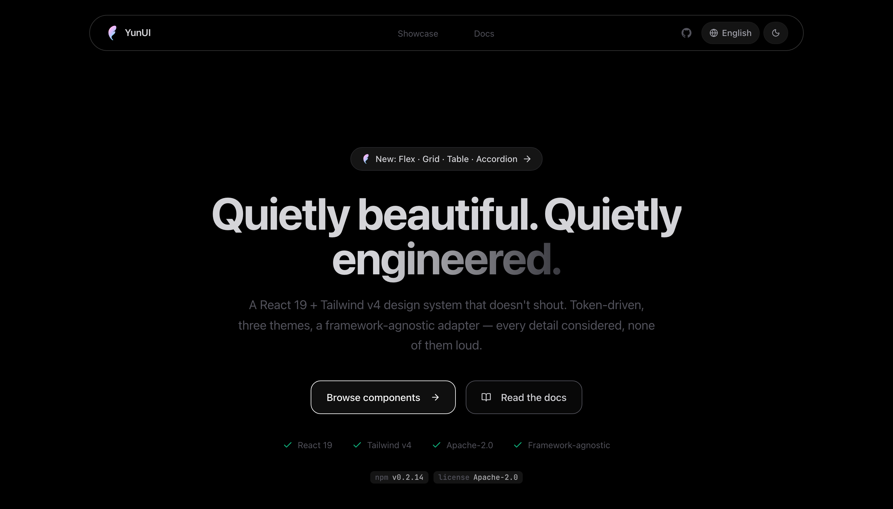
Three themes, switched via a class on the root element (works with next-themes): light (default :root), .dark, and .true-black (OLED).
# In YunUI: edit code → bump the version in package.json → commit
git tag v0.2.0 && git push origin v0.2.0
# ↑ pushing the tag triggers GitHub Actions: typecheck → test → build → npm publish
#   (tokenless OIDC trusted publishing + provenance; no local publish/OTP needed)

# In the consuming project:
pnpm up @yuhuanowo/yunui
Publishing runs via GitHub Actions (
.github/workflows/release.yml). One-time setup: on npmjs.com, under the package's Settings → Trusted Publisher, add the GitHub Actions publisher (repoYuhuanStudio/YunUI, workflowrelease.yml). No npm token required.
pnpm install
pnpm dev        # tsup watch (pairs with the site/ live preview)
pnpm build      # produce dist/
pnpm typecheck
pnpm test
The showcase site lives in site/ (Next 16 + Tailwind v4): pnpm --filter yunui-site dev.
Full guidelines are in CONTRIBUTING.md. The most common pitfall: components carry no copy and bind no i18n library. Any component that shows text must go through an adapter — don't import next-intl, don't hardcode strings:
import { useYunUI } from "../adapters/context";

export function Thing() {
  const t = useYunUI().useT("thing");   // namespace
  return <button>{t("submit")}</button>; // a key, not a literal
}- Without a provider,
useTreturns the key directly (the component still renders — that's how the showcase runs). - Real translations live in the consumer (e.g. Yunxin's
messages/{en,zh-CN,zh-TW}.json), not in YunUI. - Same idea for routing/images via
useYunUI().Link/Image/useRouter(nevernext/*), and business data via props (nouseBranding/fetch/localStorageinside a component).
Apache-2.0 © YuhuanStudio