Style Guide
Last Updated: 27 April 2020 by @fionnachan
Document Status: WIP
This document serves as the reference for anyone involved in Pathmind webapp UI development work.
This section describes the global standard for the app. They are the foundation of all components and pages. All new designs should make use of the following.
They are specified in styles.css as CSS variables used by Vaadin components. For new CSS rules defined, these variables should be used whenever possible to promote visual consistency throughout the app. The use of exceptions or hard-coded values within the newly-defined CSS rules are discouraged.
--pm-primary-color: #4f97aa;
--pm-text-color: #1a2949;
--pm-secondary-text-color: #888888;
--pm-friendly-color: #3a966b;
--pm-danger-color: #d80947;
--pm-orange-color: #ed7820;
--pm-blue-color: #1900ff;
--pm-red-color: #930100;
--pm-green-color: #00a60b;
--pm-gray-color-darkest: #404040;
--pm-gray-color-darker: #707070;
--pm-gray-color-dark: #888888;
--pm-gray-color: #b3b6c2;
--pm-gray-color-light: #d0d0d0;
--pm-gray-color-lighter: #dee3ed;
--lumo-font-family: Arial, "Helvetica Neue", Helvetica, sans-serif;
For different screen width, we have specified a different font-size at the root element for the whole app. Because we are using rem as the unit for font size, all these font size will change based on the root element font-size.
| Screen Width | Root Element Font Size |
|---|---|
| ≤1024px | 13px |
| 1025 - 1280px | 14px |
| ≥1281px | 16px |
| Font Size CSS Variable | CSS Value | Screen Width ≤1024px |
Screen Width 1025 - 1280px |
Screen Width ≥1281px |
|---|---|---|---|---|
| --lumo-font-size-xxl | 1.875rem | 24.375px | 26.25px | 30px |
| --lumo-font-size-xl | 1.5rem | 19.5px | 21px | 24px |
| --lumo-font-size-l | 1.25rem | 16.25px | 17.5px | 20px |
| --lumo-font-size-m | 1rem | 13px | 14px | 16px |
| --lumo-font-size-s | 0.875rem | 11.375px | 12.25px | 14px |
| --lumo-font-size-xs | 0.75rem | 9.75px | 10.5px | 12px |
As we would like to make the app responsive for different screen size, following Vaadin's standard, we are using spacing that is rem-based, similar to the font size set.
| Spacing CSS Variable | CSS Value | Screen Width ≤1024px |
Screen Width 1025 - 1280px |
Screen Width ≥1281px |
|---|---|---|---|---|
| --lumo-space-xxl | 4rem | 52px | 56px | 64px |
| --lumo-space-xl | 2.5rem | 32.5px | 35px | 40px |
| --lumo-space-l | 1.75rem | 22.75px | 24.5px | 28px |
| --lumo-space-m | 1.125rem | 14.625px | 15.75px | 18px |
| --lumo-space-s | 0.75rem | 9.75px | 10.5px | 12px |
| --lumo-space-xs | 0.375rem | 4.875px | 5.25px | 6px |
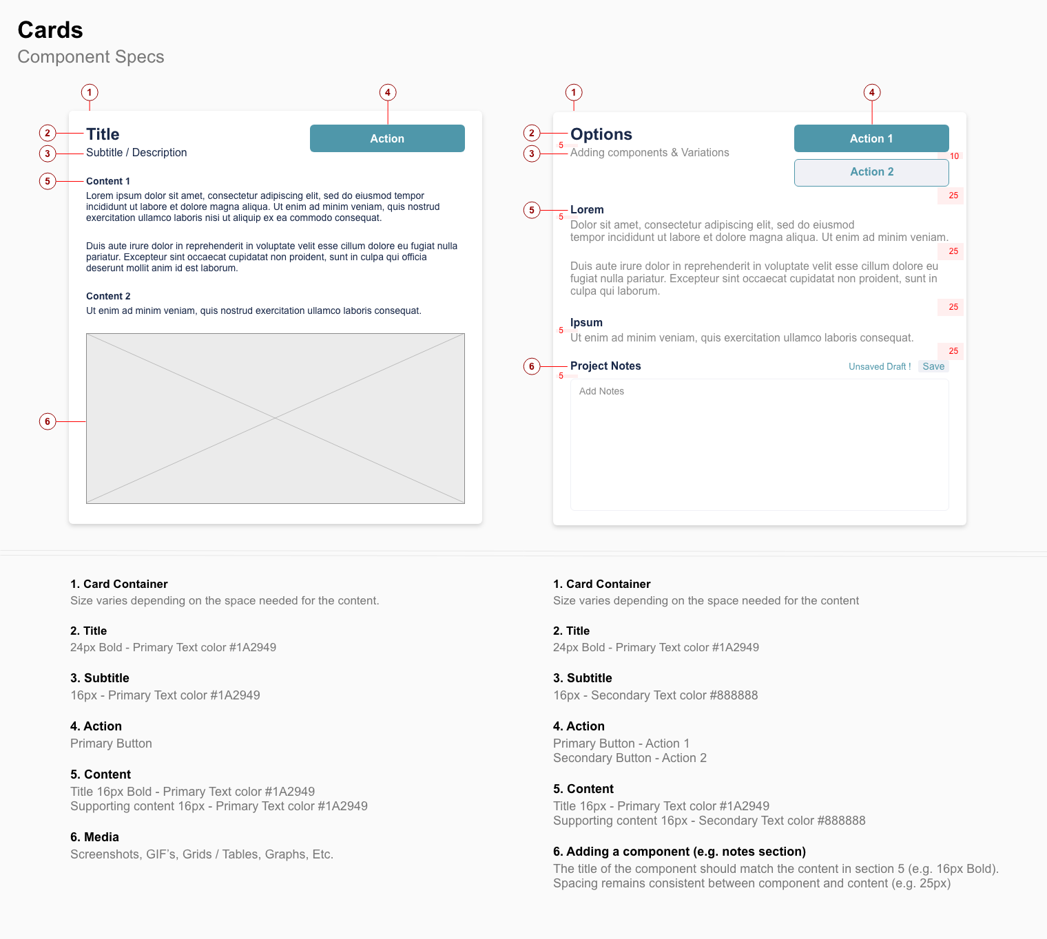
| Part | Java Class | CSS Class |
|---|---|---|
| Card Container | ViewSection | card |
| Title | Span | section-title-label |
| Subtitle / Content (#888888 color) | Paragraph | / |
TBC