





Animated, Apple-Watch-style activity rings for React — rendered with pure SVG, zero chart dependencies.
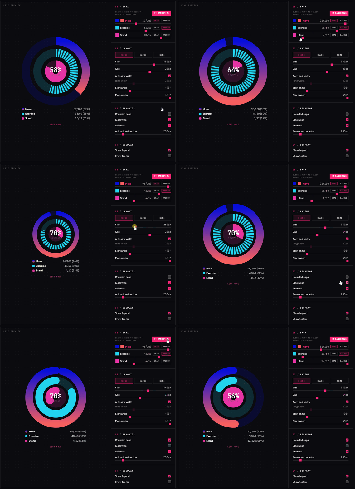
A high-performance, dependency-free React 19 + TypeScript library for multi-layer radial (activity-ring) charts. It takes an array of { value, max, color, label } items and renders concentric progress rings with smooth animated transitions. Built with a focus on clean architecture (math fully separated from the UI), performance (rAF-based tweening with proper cleanup), and robust, strict TypeScript (no any).
- Pure SVG rendering: crisp at any DPI, responsive via
viewBox, no canvas or heavy chart libs. - Smooth animations:
requestAnimationFrametweening with ease-out cubic; honorsprefers-reduced-motion. - Fully responsive: recalculates radius and stroke widths from the container size via
ResizeObserver, or pass a fixedsize. - Accessible by design: each ring is a
role="progressbar"witharia-valuenow/min/max; optional legend andpattern(dashed) support so color is never the only indicator. - Flexible layouts: full circle, gauge (270°) or semicircle (180°) via
maxSweepDegrees; optional hover tooltip and centered content viachildren. - Strictly typed & tree-shakeable: precise interfaces, ESM + CJS builds,
sideEffects-aware, ships its own tiny CSS.
Challenge: An SVG elliptical arc (
Acommand) cannot draw a full 360° circle — start and end points coincide, so the arc collapses and renders nothing. Solution:describeArcdetects a full sweep and emits two half-arcs instead, while still supporting partial sweeps (gauges/semicircles) through a singlesweepDegreesparameter. All of this lives in a pure, unit-testedcore/geometrymodule with zero React, keeping trigonometry completely separate from the rendering layer.
Challenge: Animating many rings without stale closures or leaked animation frames. Solution: A dedicated
useAnimatedValuehook owns onerequestAnimationFrameloop per ring, restarts cleanly from the currently displayed value when the target changes, and always cancels the frame on cleanup. Per-ring hooks live inside theRadialRingcomponent (never inside a.map()), respecting the Rules of Hooks.
- Frontend: TypeScript, React 19, plain CSS + CSS variables (library); Tailwind CSS v4 (demo only)
- Core APIs: SVG,
requestAnimationFrame,ResizeObserver,matchMedia - Tooling: Vite (library mode), Vitest + Testing Library, ESLint (flat config + a local plugin), Prettier, Storybook, Changesets, size-limit
npm install multi-layer-radial-chartReact 19 is a peer dependency.
import { RadialChart } from "multi-layer-radial-chart";
import "multi-layer-radial-chart/styles.css";

const data = [
  { value: 82, max: 100, color: "#fb2576", label: "Move" },
  { value: 45, max: 60, color: "#22d3ee", label: "Exercise" },
  { value: 9, max: 12, color: "#a3e635", label: "Stand" },
];

export function Dashboard() {
  return (
    <RadialChart data={data} showLegend showTooltip>
      <strong>82%</strong>
    </RadialChart>
  );
}| Prop | Type | Default | Description |
|---|---|---|---|
data |
RadialDatum[] |
— | Series to render, outermost ring first. |
size |
number |
responsive | Fixed pixel size; omit to size to the container width. |
startAngle |
number |
-90 |
Angle (deg) where arcs begin (-90 = 12 o'clock). |
gap |
number |
6 |
Pixel gap between rings. |
ringWidth |
number |
auto | Fixed stroke width; auto-derived when omitted. |
rounded |
boolean |
true |
Round the arc line caps. |
allowOverflow |
boolean |
false |
Let values > max overrun as an overlapping extra lap. |
animate |
boolean |
true |
Animate value transitions. |
animationDurationMs |
number |
800 |
Tween duration. |
clockwise |
boolean |
true |
Draw arcs clockwise. |
maxSweepDegrees |
number |
360 |
Total sweep; 270 gauge, 180 semicircle. |
showLegend |
boolean |
false |
Render the built-in legend. |
showTooltip |
boolean |
false |
Show a hover tooltip per ring. |
onSegmentClick |
(datum, index) => void |
— | Click/keyboard activate a ring (makes rings focusable). |
onSegmentHover |
(datum, index) => void |
— | Fires on pointer enter/move over a ring. |
onSegmentLeave |
(datum, index) => void |
— | Fires when the pointer leaves a ring. |
className |
string |
— | Class applied to the outer container. |
children |
ReactNode |
— | Content rendered in the chart's center. |
Each RadialDatum is { value, max, color, label, trackColor?, pattern?, gradient?, threshold? } where pattern is "solid" | "dashed".
Set allowOverflow so a value greater than its max overruns the ring as an overlapping extra lap (Apple-Watch style) instead of clamping at 100%:
<RadialChart allowOverflow data={[{ value: 135, max: 100, color: "#fb2576", label: "Move" }]} />Give a datum a threshold (in the same units as value) to draw a tick on its track marking a goal. Style it with the --rc-marker-color CSS variable:
<RadialChart data={[{ value: 82, max: 100, color: "#fb2576", label: "Move", threshold: 90 }]} />Provide onSegmentClick to make each ring clickable and keyboard-focusable (Tab to focus, Enter/Space to activate). onSegmentHover / onSegmentLeave report pointer enter/leave and are independent of the built-in tooltip:
<RadialChart
  data={data}
  onSegmentClick={(datum, index) => console.log("clicked", index, datum.label)}
  onSegmentHover={(datum) => setActive(datum.label)}
/>
Focused rings show a :focus-visible outline you can theme with the --rc-focus-color CSS variable.
Give any datum a gradient to fill its progress arc with an SVG-native linear or radial gradient (it overrides color):
const data = [
  {
    value: 82,
    max: 100,
    label: "Move",
    color: "#fb2576", // fallback if gradient is ignored
    gradient: {
      type: "linear", // "linear" | "radial"
      angle: 45,       // degrees, linear only (0 = left→right)
      stops: [
        { offset: 0, color: "#f472b6" },
        { offset: 1, color: "#8b5cf6" },
      ],
    },
  },
];
Note: SVG paint supports
linearandradialgradients natively. A true conic (angular) gradient is not part of the SVG spec, so it is intentionally not offered.
Anything you pass as children is centered inside the rings. Use the useCountUp hook for an animated number:
import { RadialChart, useCountUp } from "multi-layer-radial-chart";

function Ring({ percent }: { percent: number }) {
  const value = useCountUp(percent, { durationMs: 1200 });
  return (
    <RadialChart data={[{ value: percent, max: 100, color: "#6366f1", label: "Goal" }]}>
      <strong>{value}%</strong>
    </RadialChart>
  );
}Need full control over the markup? useRadialChart computes all the geometry (radii, stroke widths and ready-to-use SVG path strings) and renders nothing, so you can build your own SVG:
import { useRadialChart } from "multi-layer-radial-chart";

function CustomRings({ data }: { data: RadialDatum[] }) {
  const { size, rings } = useRadialChart(data, { size: 240, gap: 6 });
  return (
    <svg viewBox={`0 0 ${size} ${size}`} width={size} height={size}>
      {rings.map((ring, i) => (
        <g key={i}>
          <path d={ring.trackPath} fill="none" stroke="#eee" strokeWidth={ring.strokeWidth} />
          <path
            d={ring.progressPath}
            fill="none"
            stroke={ring.datum.color}
            strokeWidth={ring.strokeWidth}
            strokeLinecap="round"
          />
        </g>
      ))}
    </svg>
  );
}
The library also exports the lower-level building blocks — useAnimatedValue, useElementSize, useReducedMotion, describeArc, gradientVector, polarToCartesian, computeRingLayout, toFraction, toPercent — for advanced compositions.
The math is fully decoupled from React. Import the /core subpath to get the pure geometry, scaling, layout, validation and color helpers with zero React in the dependency graph — use it from Vue, Svelte, Solid, vanilla JS, a <canvas> renderer, or on the server:
import { validateData, computeRingLayout, describeArc } from "multi-layer-radial-chart/core";

const data = [{ value: 82, max: 100, color: "#fb2576", label: "Move" }];
const rings = validateData(data);
const layout = computeRingLayout(rings.length, 240, 6);
const path = describeArc(120, 120, layout[0].radius, rings[0].fraction, -90, true);
// → feed `path` into any SVG/Canvas renderer
The /core entry exports describeArc, describeArcSegment, polarToCartesian, gradientVector, markerLine, computeRingLayout, toFraction, toPercent, toRawFraction, validateData, normalizeDatum, contrastingColor, contrastShadow, and all non-React types (RadialDatum, NormalizedDatum, RingGradient, Point, RingLayout, …).
# Clone the repository
git clone https://github.com/MosheHatab/multi-layer-radial-chart.git

# Install dependencies
npm install

# Run the demo playground
npm run dev

# Storybook
npm run storybook

# Verify everything
npm run typecheck && npm run lint && npm run test && npm run build && npm run size
Optional: the repository includes the
ui-ux-pro-maxdesign skill under.cursor/skills/(used only for designing the demo). Its scripts require Python 3 (python --version; on Windowswinget install Python.Python.3.12). It is not needed to build or use the library.
- Demo → Vercel: builds with
npm run build:demotodist-demo/(seevercel.json). Import the repo in Vercel once; it auto-deploys on push. Live at multi-layer-radial-chart-five.vercel.app. - Storybook → GitHub Pages: the
Deploy Storybookworkflow publishesstorybook-static/(enable Pages with source "GitHub Actions" once). Live at moshehatab.github.io/multi-layer-radial-chart.
The package is versioned with Changesets. Pick one of the two flows below — don't mix them.
Automated (recommended): commit a changeset and let CI do the rest.
npm run changeset   # describe the change; pick the semver bump
git commit -am "feat: ..." && git push
On push to main, the Release workflow opens a "Version Packages" PR. Merging that PR bumps the version, updates CHANGELOG.md, and publishes to npm (requires the NPM_TOKEN repository secret).
Manual (from local): build, validate, and publish in one step.
npm run version       # applies pending changesets + updates CHANGELOG.md (skip for first publish)
npm run publish:safe  # build → publint + are-the-types-wrong → npm publish
git commit -am "release" && git push   # commit the version bump / changelog
publish:safe is idempotent-friendly: npm publish refuses to overwrite an existing version, and CI's changeset publish skips versions already on npm — so pushing after a manual publish never double-publishes. Package exports/types can be validated anytime without publishing via npm run check:package.
MIT © 2026 Moshe Hatab