
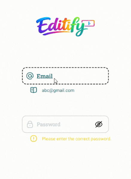
A beautiful and lightweight Material-style EditText library with smooth floating hint animation.
A beautiful, fully customizable, animated Android input field library with floating hint, password toggle, helper/warning/error messages, RTL support, and smooth animations.
Editify provides a modern CustomInputEdit component that replaces the default EditText with advanced UX features commonly seen in premium apps.
- Floating hint animation with scale and color transition
- Password visibility toggle (show/hide with custom icons)
- Helper, Warning & Error states with optional icons and colors
- Full RTL support (
rightDirectionattribute) - Highly customizable colors, fonts, sizes, backgrounds, and icons
- Smooth animations using Android's
ObjectAnimatorandValueAnimator - Works with both Kotlin and Java projects
- Zero dependencies – pure AndroidX + ConstraintLayout
- JitPack ready for instant integration
In your root settings.gradle (or settings.gradle.kts):
dependencyResolutionManagement {
		repositoriesMode.set(RepositoriesMode.FAIL_ON_PROJECT_REPOS)
		repositories {
			mavenCentral()
			maven { url 'https://jitpack.io' }
		}
}dependencies {
implementation 'com.github.Melikash98:Editify:v1.7.0'
}<com.melikash98.editify.CustomInputEdit
android:id="@+id/myCustomInput"
android:layout_width="match_parent"
android:layout_height="wrap_content"
<!-- Hint configuration -->
app:hintText="Username" <!-- Main hint text -->
app:hintIcon="@drawable/ic_user" <!-- Icon inside hint -->
app:hintColor="@color/gray" <!-- Default hint color -->
app:hintActiveColor="@color/green" <!-- Color when focused/active -->
app:hintBackgroundColor="@color/white" <!-- Background of the floating hint -->
<!-- Input text styling -->
app:inputColor="@color/black" <!-- Text color inside the input field -->
app:textColor="@color/black" <!-- Fallback text color -->
<!-- Font & Size Configuration -->
app:hintFamily="@font/vazirmatn_medium" <!-- Hint font (supports @font/ or font family name) -->
app:hintSize="16sp" <!-- Hint text size -->
app:inputFamily="@font/vazirmatn" <!-- Input field font -->
app:inputSize="17sp" <!-- Input text size -->
app:helperFamily="@font/vazirmatn_light" <!-- Helper/Warning/Error font -->
app:helperSize="13.5sp" <!-- Helper/Warning/Error text size -->
<!-- Multiline (optional) -->
android:singleLine="false" <!-- false = multiline, true = single line -->
android:maxLines="5" <!-- Max lines before scroll -->
android:minLines="1" <!-- Min height in lines -->
<!-- Background states -->
app:activeBackground="@drawable/input_active" <!-- Background when focused -->
app:inactiveBackground="@drawable/input_inactive" <!-- Default background -->
<!-- Helper / Warning / Error messages -->
app:helperText="Enter your username" <!-- Helper message -->
app:warningText="Please check your input" <!-- Warning message -->
app:errorText="This field is required" <!-- Error message -->
<!-- Password toggle icons -->
app:passShow="@drawable/ic_show" <!-- Icon when password is visible -->
app:passHide="@drawable/ic_hide" <!-- Icon when password is hidden -->
<!-- Layout direction -->
app:rightDirection="false" <!-- Set true for RTL languages -->
<!-- Input Type (especially for passwords) -->
<!-- app:inputType="textPassword" --> <!-- Text Password (hidden) -->
<!-- app:inputType="numberPassword" --> <!-- Number Password -->
<!-- app:inputType="text" --> <!-- Normal text (default) -->
<!-- Dropdown -->
app:dropdownMode="false" <!-- true = disables keyboard, shows dropdown arrow -->
app:dropdownBackground="@color/white" <!-- Background color of the dropdown popup card -->
app:dropdownItemTextColor="@color/black" <!-- Text color of each dropdown item -->
app:dropdownItemTextSize="15sp" <!-- Font size of each dropdown item text -->
app:dropdownItemFamily="@font/vazirmatn" <!-- Font applied to dropdown item texts -->
app:dropdownItemIcon="@drawable/ic_list_item" <!-- Default icon for items that have no custom icon -->
app:dropdownSelectedColor="@color/primary" <!-- Highlight color for the currently selected item -->
app:dropdownDividerColor="@color/gray_light" <!-- Color of the divider line between items -->
app:dropdownItemHeight="52dp" <!-- Height of each individual dropdown item row -->
app:dropdownMaxHeight="220dp" <!-- Max height of the dropdown popup before it scrolls -->
<!-- Button Mode -->
app:buttonMode="false" <!-- true = disables input, entire field acts as a button -->
/>
// Get reference to the custom input view
CustomInputEdit input = findViewById(R.id.myCustomInput);

// Get current text value (trimmed)
String text = input.getText();

// Set text programmatically
input.setText("Hello");

// Show helper message (green state)
input.setHelperText("Helper message");

// Show warning message (yellow state)
input.setWarningText("Warning message");

// Show error message (red state)
input.setErrorText("Error message");

// Add dropdown items
input.addDropdownItem("Lable", "Value");
// Add items with icon
input.addDropdownItem("Iran", "IR", R.drawable.ic_flag_ir);

// Handle item selection
input.setOnDropdownItemSelectedListener(new CustomInputEdit.OnDropdownItemSelectedListener() {
    @Override
    public void onItemSelected(DropdownItem dropdownItem, int position) {
        // Save selected gender value
       TextView text = dropdownItem.value;
    }
});

// Set items from a list
List<DropdownItem> items = new ArrayList<>();
items.add(new DropdownItem("Iran", "IR"));
items.add(new DropdownItem("Germany", "DE"));
dropdown.setDropdownItems(items);

// Get selected value
String selectedValue = dropdown.getSelectedValue();
DropdownItem selectedItem = dropdown.getSelectedDropdownItem();

// Select item programmatically
dropdown.setSelectedValue("IR");class MainActivity : AppCompatActivity() {
private lateinit var emailInput: CustomInputEdit
override fun onCreate(savedInstanceState: Bundle?) {
super.onCreate(savedInstanceState)
setContentView(R.layout.activity_main)
emailInput = findViewById(R.id.emailInput)
// Set text programmatically
emailInput.setText("test@example.com")
// Get input text
val value = emailInput.getText()
// Update helper message
emailInput.setHelperText("Looks good")
// Show warning
emailInput.setWarningText("Please double check your email")
// Show error
emailInput.setErrorText("Invalid email address")
val dropdown = findViewById<CustomInputEdit>(R.id.countryDropdown)
dropdown.addDropdownItem("Iran", "IR", R.drawable.ic_flag_ir)
dropdown.addDropdownItem("Germany", "DE")
dropdown.setOnDropdownItemSelectedListener { item, position ->
Toast.makeText(this, "Selected: ${item.label}", Toast.LENGTH_SHORT).show()
}
val selected = dropdown.getSelectedValue()
}
}| Attribute | Description |
|---|---|
| hintText | Hint text |
| input | Default input text |
| helperText | Helper message |
| warningText | Warning message |
| errorText | Error message |
| hintIcon | Icon shown inside the hint |
| passShow | Show password icon |
| passHide | Hide password icon |
| helperIcon | Helper icon |
| warningIcon | Warning icon |
| errorIcon | Error icon |
| activeBackground | Background when the field is focused/active |
| inactiveBackground | Default (inactive) background |
| hintColor | Default hint color |
| hintActiveColor | Hint color when focused |
| inputColor | Color of text inside the input field |
| helperColor | Helper text and icon color |
| warningColor | Warning text and icon color |
| errorColor | Error text and icon color |
| inputType | Input type (especially useful for passwords) |
| rightDirection | Enable RTL layout (true/false) |
| hintFamily | Font family for hint (@font/ resource or font name) |
| hintSize | Text size for hint |
| inputFamily | Font family for input field |
| inputSize | Text size for input field |
| helperFamily | Font family for helper/warning/error texts |
| helperSize | Text size for helper/warning/error texts |
| dropdownMode | Enable dropdown mode (true/false) |
| dropdownBackground | Background of the dropdown menu |
| dropdownItemTextColor | Text color of dropdown items |
| dropdownItemTextSize | Text size of dropdown items |
| dropdownItemFamily | Font family of dropdown items |
| dropdownItemIcon | Icon shown beside each dropdown item |
| dropdownArrowIcon | Arrow icon for the dropdown field |
| dropdownSelectedColor | Color of the selected dropdown item |
| dropdownDividerColor | Divider color between dropdown items |
| dropdownItemHeight | Height of each dropdown item |
| dropdownMaxHeight | Maximum height of the dropdown list |
| buttonMode | Enable button mode (true/false) |
app:inputType="text"      <!-- Normal Text -->
app:inputType="numberPassword"    <!-- Password (Text) -->
app:inputType="textPassword" <!-- Password (Number) -->app:rightDirection="true"app:dropdownMode="false" <!-- true = disables keyboard, shows dropdown arrow -->
app:dropdownBackground="@color/white" <!-- Background color of the dropdown popup card -->
app:dropdownItemTextColor="@color/black" <!-- Text color of each dropdown item -->
app:dropdownItemTextSize="15sp" <!-- Font size of each dropdown item text -->
app:dropdownItemFamily="@font/vazirmatn" <!-- Font applied to dropdown item texts -->
app:dropdownItemIcon="@drawable/ic_list_item" <!-- Default icon for items that have no custom icon -->
app:dropdownSelectedColor="@color/primary" <!-- Highlight color for the currently selected item -->
app:dropdownDividerColor="@color/gray_light" <!-- Color of the divider line between items -->
app:dropdownItemHeight="52dp" <!-- Height of each individual dropdown item row -->
app:dropdownMaxHeight="220dp" <!-- Max height of the dropdown popup before it scrolls -->
This project is licensed under the MIT License.
android custom edittext, floating hint edittext, material input field android, password toggle edittext, android ui library, custom input view
If you find MorphNavBar useful, please consider giving it a ⭐ star on GitHub — it helps the project grow and motivates further development.
For feature requests, improvements, bug reports, or similar suggestions, please send me a message or open an issue. Your feedback is highly appreciated.