The rows in the applications window don't look like the rest of the app's boxed lists. Every button in them - Run, Add To Menu / Remove From Menu, and Remove under Exported Binaries - has the pill style plus a fixed width_request (100 and 200 px), and there is a gtk::Separator between Run and the menu button. In a suffix box those buttons get stretched to the row's full height, so the pills come out as tall ovals, the fixed widths line them up into columns, and the separator draws a divider between them: the list reads as a table of oversized buttons rather than a list of apps with actions.
The app name pays for it. With 300 px of the row reserved for buttons the title gets whatever is left, and in a narrower window it wraps or hyphenates ("Clau-de", "Syste-m Setti-ngs") while the buttons stay big.
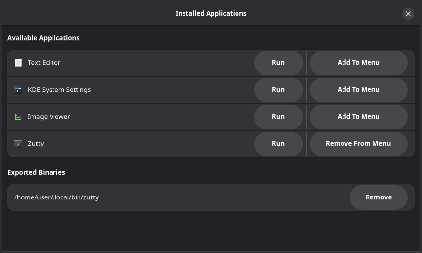
(Captured on a virtual display with a stub distrobox that returns four desktop files and one exported binary; a real box looks the same, only with real apps.)
Everywhere else the app uses libadwaita's own row layout, and the HIG shape for an action in a boxed-list row is a normal-sized button vertically centred in the row. I think that is all these rows need: drop the pill class, the width requests and the separator, and give the buttons valign: center, so they take their natural size and the title gets the room. It gets worse the more buttons a row has - the Uninstall button from #211 makes it a three-column table - so it seems worth fixing at the source before that lands.
I have the change ready and will open a PR.
The rows in the applications window don't look like the rest of the app's boxed lists. Every button in them - Run, Add To Menu / Remove From Menu, and Remove under Exported Binaries - has the
pillstyle plus a fixedwidth_request(100 and 200 px), and there is agtk::Separatorbetween Run and the menu button. In a suffix box those buttons get stretched to the row's full height, so the pills come out as tall ovals, the fixed widths line them up into columns, and the separator draws a divider between them: the list reads as a table of oversized buttons rather than a list of apps with actions.The app name pays for it. With 300 px of the row reserved for buttons the title gets whatever is left, and in a narrower window it wraps or hyphenates ("Clau-de", "Syste-m Setti-ngs") while the buttons stay big.
(Captured on a virtual display with a stub
distroboxthat returns four desktop files and one exported binary; a real box looks the same, only with real apps.)Everywhere else the app uses libadwaita's own row layout, and the HIG shape for an action in a boxed-list row is a normal-sized button vertically centred in the row. I think that is all these rows need: drop the pill class, the width requests and the separator, and give the buttons
valign: center, so they take their natural size and the title gets the room. It gets worse the more buttons a row has - the Uninstall button from #211 makes it a three-column table - so it seems worth fixing at the source before that lands.I have the change ready and will open a PR.