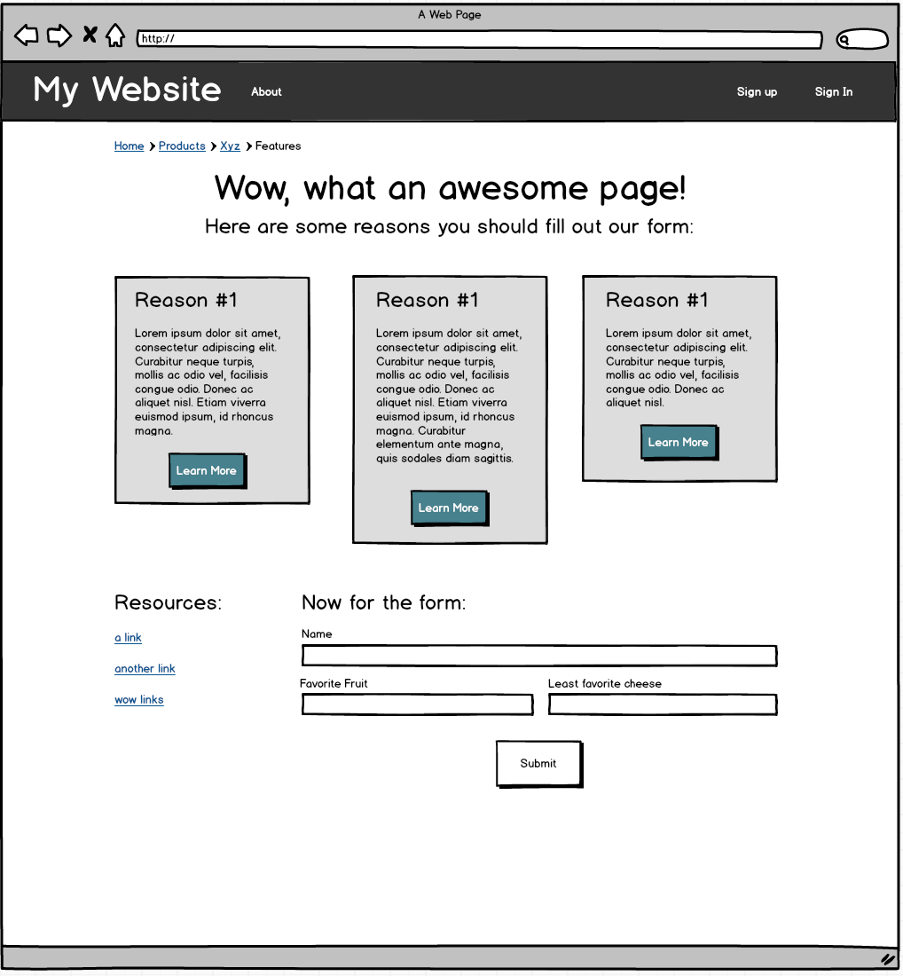
We're going to practice using Foundation by implementing a design from a wireframe. As a developer, you'll often get or make wireframes that sketch out the approximate look of a web page, like this one. (This wireframe was created using Balsamiq.)
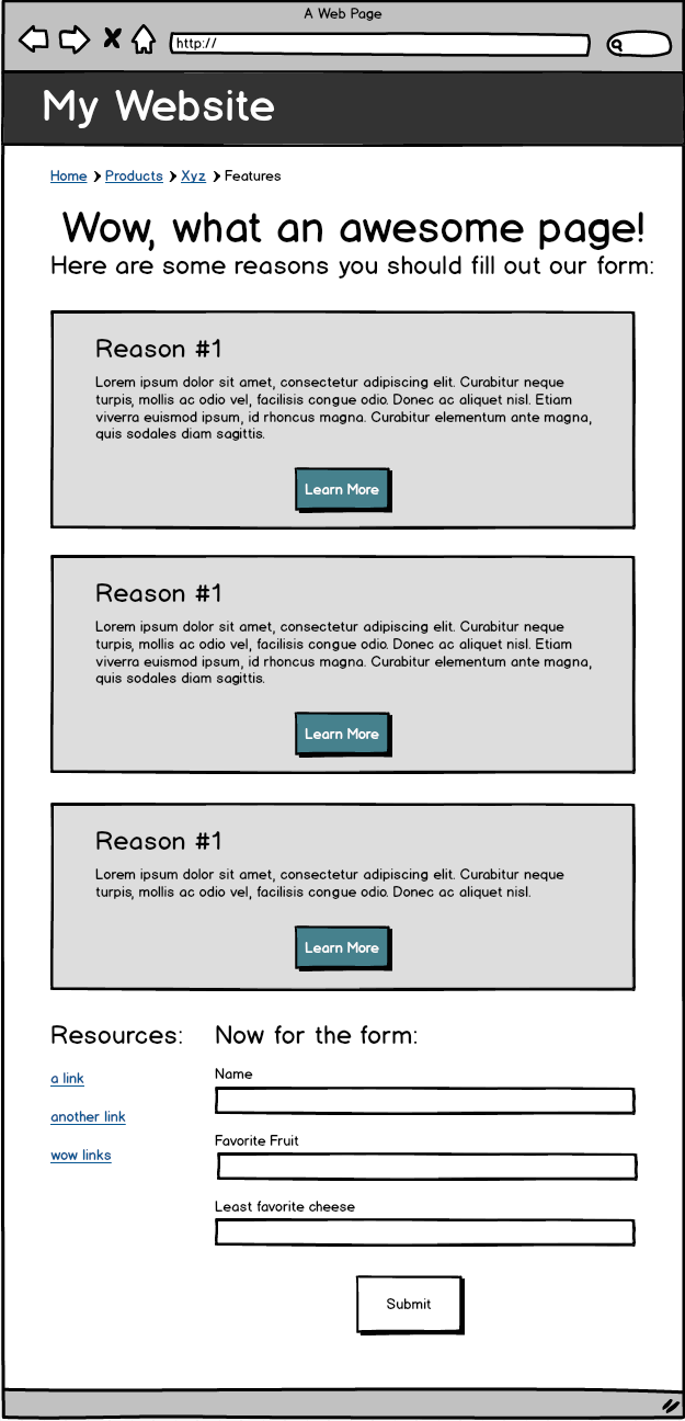
In this tutorial, you'll use the files provided to walk through the process of creating a website that looks like this:
Once you have downloaded the exercise, do note that we are using a layout.erb file, as well as index.erb. Anything that we want to show up on every page - such as the page header - should be put in layout.erb, and page-specific content, for now, should be put in index.erb.
Visit the Downloads Section of the Foundation Website, and click the button to "Download Everything." Once you have extracted the downloaded file, copy the contents to the public folder of your app. (Change the xs in the below command to match the numbers in the version downloaded).
$ cp -r ~/Downloads/foundation-6.x.x-complete/* ~/challenges/foundation-tutorial/public
Your public folder should look like this:
$ cd challenges/foundation-tutorial/public
$ tree public

public
├── css
│   ├── app.css
│   ├── foundation.css
│   └── foundation.min.css
├── index.html
├── js
│   ├── app.js
│   └── vendor
│       ├── foundation.js
│       ├── foundation.min.js
│       ├── jquery.js
│       └── what-input.js
└── stylesheets
    └── style.css

4 directories, 10 files
Next, add these files to your layout.erb file. Put CSS files in the <head> of the document, and JS files just before the closing </body> tag:
...
<!-- stylesheets -->
<link rel="stylesheet" href="css/foundation.css">
<link rel="stylesheet" href="stylesheets/style.css">
...
...
<!-- javascript -->
<script src="js/vendor/jquery.js"></script>
<script src="js/vendor/what-input.js"></script>
<script src="js/vendor/foundation.js"></script>
<script src="js/app.js"></script>
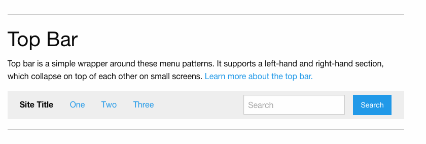
...When making a Top Bar, I always start by copy-and-pasting from Foundation's docs. Visit http://foundation.zurb.com/docs and click "Navigation > Overview" along the side bar to view the relevant documentation.
The navbar shown under the Top Bar section looks pretty similar to what we're going for:
To use it, let's click on the "Top Bar" link along the left side of the page, and then copy and paste the provided code example, then edit it to suit our needs. Copy that code and paste it in layout.erb, right inside the opening body tag (and above the line that says <%= yield %>).
Now let's edit that code, piece by piece:
<div class="top-bar">
  <div class="top-bar-left">
    <ul class="dropdown menu" data-dropdown-menu>
      <li class="menu-text">Site Title</li>

      <!-- ... -->
The above section sets the title of the site. First of all, let's change "Site Title" to the actual title of our site.
If we look at this first chunk of code in a larger context:
<div class="top-bar">
  <div class="top-bar-left">
    <ul class="dropdown menu" data-dropdown-menu>
      <li class="menu-text">Site Title</li>
      <li>
        <a href="#">One</a>
        <ul class="menu vertical">
          <li><a href="#">One</a></li>
          <li><a href="#">Two</a></li>
          <li><a href="#">Three</a></li>
        </ul>
      </li>
      <li><a href="#">Two</a></li>
      <li><a href="#">Three</a></li>
    </ul>
  </div>

  <!-- ... -->

</div>
Run the server (ruby server.rb) and navigate to http://localhost:4567/ to see Foundation in action in your app!
This code creates all the links on the left hand side of our top bar, and there's a bunch of stuff there we don't need. First of all, there are several more links shown here than we have in our designs. Second of all, Foundation has provided us with code for a Dropdown Menu, which is not in our designs.
Let's get rid of that extra code! We can delete the class of "dropdown" from the ul, along with the attribute "data-dropdown-menu." Make sure you keep the "menu" class. Last of all, delete the first li, and change the text of the other two so they match our designs.
Also, because — according to our design -- we don't need a vertical menu in our top-bar, delete the ul that has a class of "menu-vertical" (and its contents).
Next up:
<div class="top-bar">

  <!-- ... -->

  <div class="top-bar-right">
    <ul class="menu">
      <li><input type="search" placeholder="Search"></li>
      <li><button type="button" class="button">Search</button></li>
    </ul>
  </div>
</div>
This section of code sets up the contents of the right side of the top bar. Right now, it's showing a search form, which we don't want. Let's change the contents of the two lis so that instead of showing two form components, they each contain an a tag and the text shown in the designs.
Our final navbar HTML should look like this:
<!DOCTYPE html>
<html>
  <head>
    <meta charset="utf-8">
    <title>Foundation Funtimes</title>

    <!-- stylesheets -->
    <link rel="stylesheet" href="css/foundation.css">
    <link rel="stylesheet" href="stylesheets/style.css">
  </head>
  <body>

    <!-- navigation -->
    <div class="top-bar">
    <div class="top-bar-left">
      <ul class="menu">
        <li class="menu-text">My Website</li>
        <li><a href="#">About</a></li>
      </ul>
    </div>

    <div class="top-bar-right">
      <ul class="menu">
        <li><a href="#">Sign up</a></li>
        <li><a href="#">Sign In</a></li>
      </ul>
    </div>
  </div>

    <!-- main content -->
    <%= yield %>

    <!-- javascript -->
    <script src="js/vendor/jquery.js"></script>
    <script src="js/vendor/what-input.js"></script>
    <script src="js/vendor/foundation.js"></script>
    <script src="js/app.js"></script>

  </body>
</html>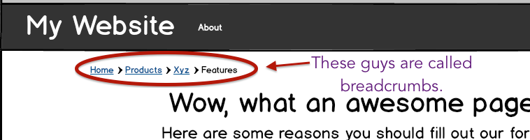
Will you look at that, Foundation has a section on breadcrumbs! Good stuff. They don't look exactly like our wireframes, but wireframes are supposed to be approximate, so that's probably okay.
Let's grab the sample code that Foundation gives us for breadcrumbs, and customize it to look like we want it to! The code we want to use for these breadcrumbs will change depending on what page we're looking at, so let's put this code in index.erb instead of our layout file. Copy and paste Foundation's example code into index.erb. Next, to customize it, replace the text with your own text and make sure that there aren't any classes like "disabled" on any list items that they shouldn't be on.
Load the page and check it out.
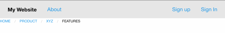
Oh no! The breadcrumbs are mushed up right against the edge of the page, instead of having nice gutters like shown in the wireframe.
Luckily Foundation rows come with a handy feature - they have a maximum width of 62.5rem. (rem is a particular type of distance measurement for web dev, similar to pixels but dynamic based on device.)
As we can see from our designs, we want all the rest of the content we'll be putting into our page to be constrained in width, and to have these gutters at the sides. Since this will presumably apply to every page, let's accomplish this by putting a row in our layout.erb file. If we wrap the row around our yield statement, it'll make sure that no contents in our index.erb file will extend beyond the desired width.
Add the row to your layout file:
<!-- main content -->
<div class="row">
  <%= yield %>
</div>
Now the gutters around the breadcrumbs - and all future content - should be in place when the screen gets wide.
BUT! When we make the screen not-super-huge, the breadcrumbs go right back to being pressed against the edge.
Foundation has a nice little built-in thing where you can make a container both a column and a row, to get some properties of both. I like to use this for my containers that wrap around all my content, so that I get both that max-width we talk about above, and also a little bit of padding on both edges from the column.
Add the class column to your container that wraps around the yield statement:
<!-- main content -->
<div class="row column">
  <%= yield %>
</div>
Now we should have a nicely constrained width on large screens, and a little bit of padding even on small screens.
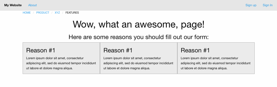
Let's add in our page headers. Below the breadcrumbs in your index.erb file, add the headers. I'm going to use an h1 and an h3:
<nav aria-label="You are here:" role="navigation">
  <ul class="breadcrumbs">
    <li><a href="#">Home</a></li>
    <li><a href="#">Product</a></li>
    <li><a href="#">Xyz</a></li>
    <li>
      <span class="show-for-sr">Current: </span> Features
    </li>
  </ul>
</nav>

<h1>Wow, what an awesome page!</h1>
<h3>Here are some reasons you should fill out our form:</h3>
But wait! Our text isn't centered! Luckily, Foundation has a handful of helper classes to help center text alignment. Read about them here. Adding the helper class text-center to something will try to center the text-alignment of all its contents.
This means we could add the class text-center to both our h1 and our h3, and that would work fine:
<h1 class="text-center">Wow, what an awesome page!</h1>
<h3 class="text-center">Here are some reasons you should fill out our form:</h3>
Alternatively we could be a little more efficient, and add a div around both the h1 and h3 and put the class text-center on that. That will tell the div to center all its contents at once. I'm going to go with that one. Here's my final code for this section:
<div class="text-center">
  <h1>Wow, what an awesome page!</h1>
  <h3>Here are some reasons you should fill out our form:</h3>
</div>Foundation has handy styles pre-defined for boxes of a slightly different color than their background, called callouts. Looking at the documentation linked here, we can see that making a div with the class of callout will give it a border, and adding the class secondary will give it that nice darker background we're looking for. Let's try that with just one box:
<div class="callout secondary">
  <h3>Reason #1</h3>
  <p>
    Lorem ipsum dolor sit amet, consectetur adipiscing elit, sed do eiusmod
    tempor incididunt ut labore et dolore magna aliqua.
  </p>
</div>
(We'll add the buttons in later.)
When we reload the page, we can see that this looks pretty good, except for one thing - the callout box is stretching all the way across the content area of our page, whereas we only want it to be taking up one third of that space (so we can fit the other two panels).
The Foundation grid system provides us with the ability to make "columns" take up a set percentage of the width of the container they reside in. Remember that Foundation thinks of columns as being ?? twelfths the width of their parent element. So in this case, we want each panel to be 4 twelfths (aka 1/3) the width of their containing row. To accomplish that, we can add the classes small-4 and columns to our panel div, in order to say: "Hey Foundation! This thing is a column, and on small screens and up, it should take up 4/12 the width of its container."
<div class="callout secondary small-4 columns">
  <h3>Reason #1</h3>
  <p>
    Lorem ipsum dolor sit amet, consectetur adipiscing elit, sed do eiusmod
    tempor incididunt ut labore et dolore magna aliqua.
  </p>
</div>
So far, so good! Now let's copy and paste that chunk of code so that we end up with three identical panels.
When we reload the page, we can see this is looking...less good. Where is the nice space between our panels?
Foundation columns have padding inside them that keeps their content from pressing up right against their edges, but they don't have any margin around them that keeps them from being pressed up against each other. As a solution, instead of having our panel be the full size of the column, let's move our panel to existing inside our column so that the padding inside the column adds some space between the panel's edges and the very edges of the column.
Now our index.erb file should look like this:
<nav aria-label="You are here:" role="navigation">
  <ul class="breadcrumbs">
    <li><a href="#">Home</a></li>
    <li><a href="#">Product</a></li>
    <li><a href="#">Xyz</a></li>
    <li>
      <span class="show-for-sr">Current: </span> Features
    </li>
  </ul>
</nav>

<div class="text-center">
  <h1>Wow, what an awesome page!</h1>
  <h3>Here are some reasons you should fill out our form:</h3>
</div>

<div class="small-4 columns">
  <div class="callout secondary">
    <h3>Reason #1</h3>
    <p>
      Lorem ipsum dolor sit amet, consectetur adipiscing elit, sed do eiusmod
      tempor incididunt ut labore et dolore magna aliqua.
    </p>
  </div>
</div>

<div class="small-4 columns">
  <div class="callout secondary">
    <h3>Reason #1</h3>
    <p>
      Lorem ipsum dolor sit amet, consectetur adipiscing elit, sed do eiusmod
      tempor incididunt ut labore et dolore magna aliqua.
    </p>
  </div>
</div>

<div class="small-4 columns">
  <div class="callout secondary">
    <h3>Reason #1</h3>
    <p>
      Lorem ipsum dolor sit amet, consectetur adipiscing elit, sed do eiusmod
      tempor incididunt ut labore et dolore magna aliqua.
    </p>
  </div>
</div>
Reload the page - much better!
Foundation has a nice section on how to make pretty-looking buttons - pretty much, the secret is to take a link and put the class button on it. So let's do that inside each of our panels:
<div class="small-4 columns">
  <div class="callout secondary">
    <h3>Reason #1</h3>
    <p>
      Lorem ipsum dolor sit amet, consectetur adipiscing elit, sed do eiusmod
      tempor incididunt ut labore et dolore magna aliqua.
    </p>
    <!-- Button -->
    <a href="#" class="button">Learn More</a>
  </div>
</div>
When we reload the page, we can see this is close to our desired look, but the buttons are left-aligned instead of centered.
To fix this, let's first try adding the class text-center to the link itself:
<a href="#" class="button text-center">Learn More</a>When we reload the page, we can see that there isn't any change.
Let's "Inspect Element" on the button to get a closer look.
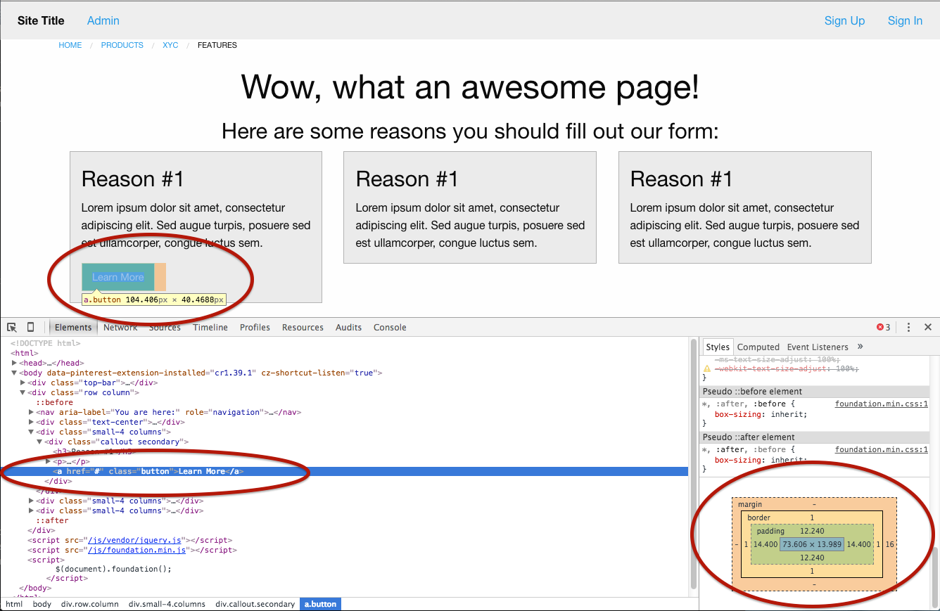
From this view, we can see that the button is only ~145px wide. What text-center does is say "For this element, I want to center the alignment of all the element's contents" - but that will only center it within the width of the element itself. For the button's text to appear centered in the panel, the button element would need to be the full width of the panel, if this is the approach we're taking.
Instead, let's take a different approach: let's take our button and wrap it in a div that has the class text-center.
<div class="small-4 columns">
  <div class="callout secondary">
    <h3>Reason #1</h3>
    <p>
      Lorem ipsum dolor sit amet, consectetur adipiscing elit, sed do eiusmod
      tempor incididunt ut labore et dolore magna aliqua.
    </p>
    <!-- Button -->
    <div class="text-center">
      <a href="#" class="button">Learn More</a>
    </div>
  </div>
</div>
Now, when we reload the page and "Inspect Element," we can see this:
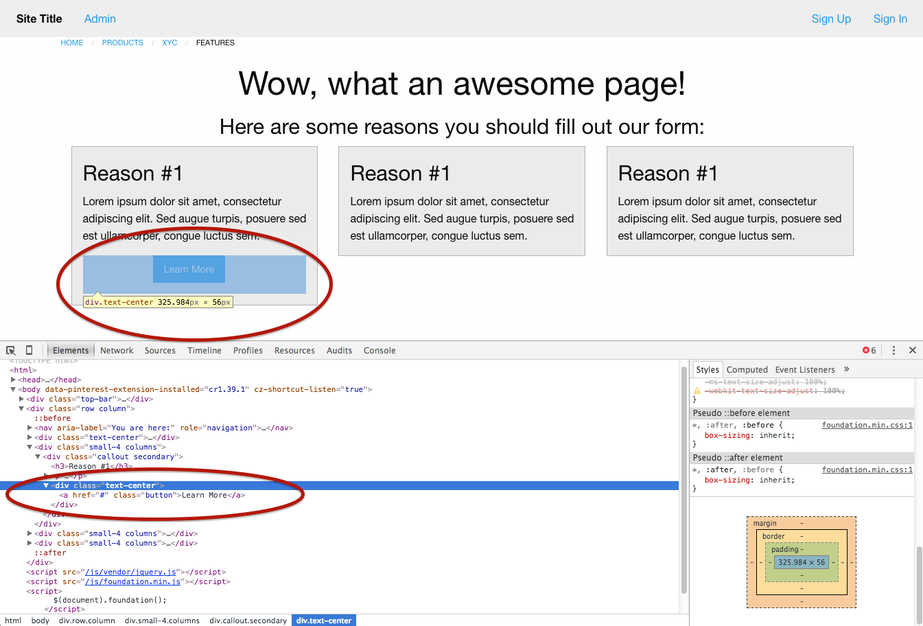
By default, divs are full-width. Therefore, when we put the class text-center on a div, it stretches to take up the full width of its parent, and then tries to center any text elements inside it. That means it successfully centers the button within our parent box.
Go ahead and add a centered button to both of the other panels on our page.
We've set things up so that they're looking good on a large screen, but we also have those mobile designs we need to follow. This wireframe is showing us that on small screens, we need the panels to be the full width of the page.
To do that, we need to change the classes we have wrapped around our panels to specify that on small screens, each panel should be 12 columns wide, and on medium-to-large screens, each panel should be 4 columns wide:
<div class="small-12 medium-4 columns">
  <div class="callout secondary">
    <h3>Reason #1</h3>
    <p>
      Lorem ipsum dolor sit amet, consectetur adipiscing elit, sed do eiusmod
      tempor incididunt ut labore et dolore magna aliqua.
    </p>
    <div class="text-center">
      <a href="#" class="button">Learn More</a>
    </div>
  </div>
</div>
Add this to each of your panels, reload the page, and we should be looking good.
From here, try to use the tools we've gone over above, along with the Foundation documentation, to complete the rest of the wireframe. Specifically check out Foundation's docs on vertical menus and forms. For the form section, make good use of Foundation's grid system.
Tip: you can add a class of button to style submit buttons as well, to get them looking good!
Once you've gotten as far as you can, feel free to check out my final version of the code here. Note that this code may differ slightly from the instructions presented here.
Remember how we added the link to the foundation.css file in our layout? Take note of the fact that it was added on the line before our link to the style.css file.
<!-- stylesheets -->
<link rel="stylesheet" href="css/foundation.css">
<link rel="stylesheet" href="stylesheets/style.css">
Our style.css file is where we can add our own custom css! style.css should be loaded after foundation.css because we want our custom css to override, or take priority over the Foundation's css. This is just one of the reasons CSS is called Cascading Style Sheets. Once you've added css to style.css, it will override stylings for similar elements where applicable, and you can beginning taking your design in your own unique direction!
Good luck!