Here’s 33 in the purple Pfhor textures:
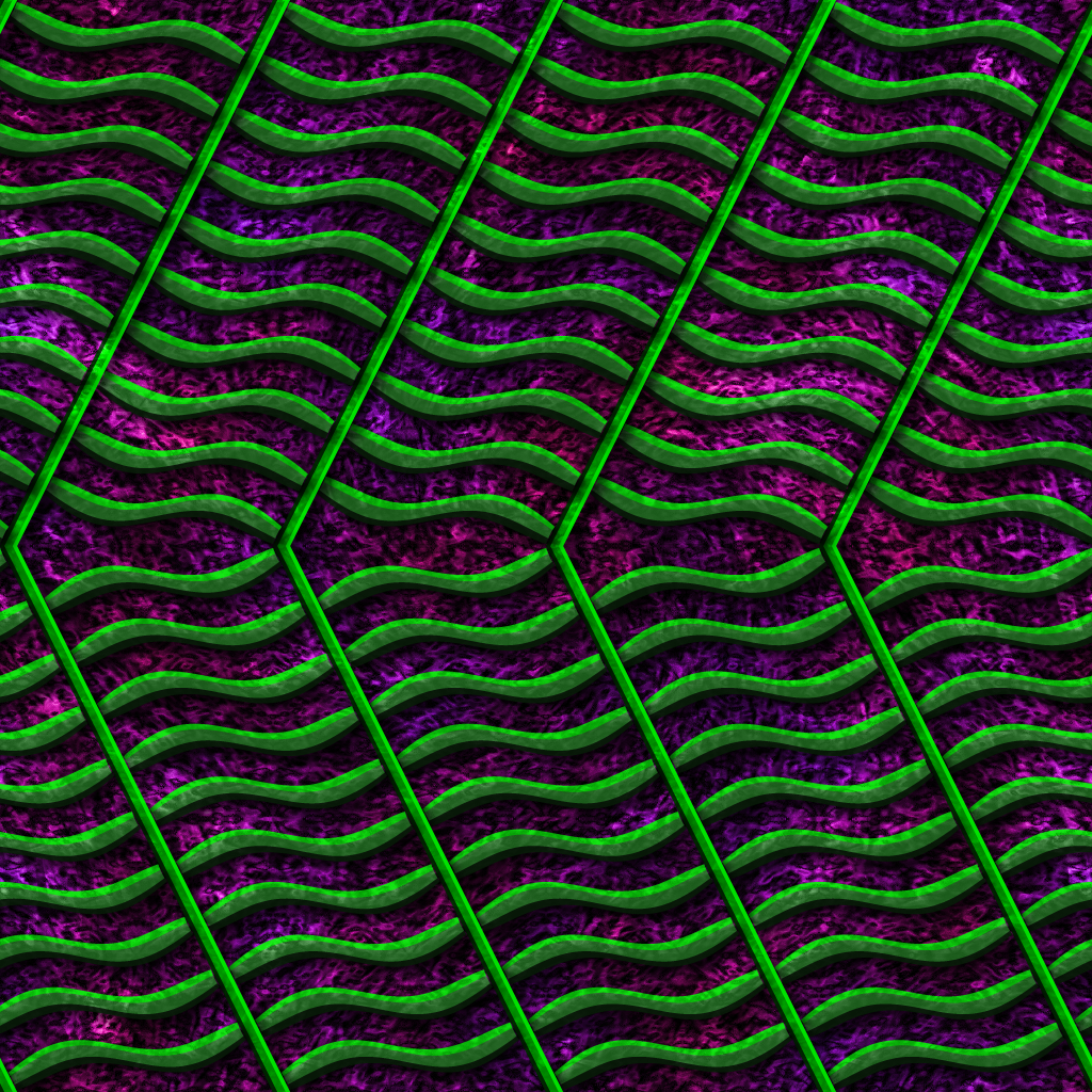
And here’s 34:
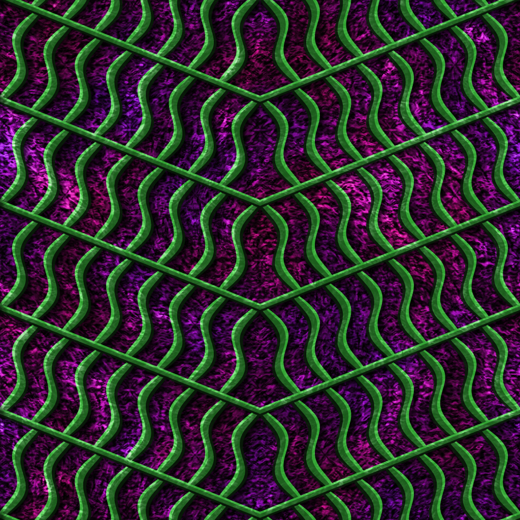
The grating in 33 is substantially more saturated. Likewise, here’s 25:
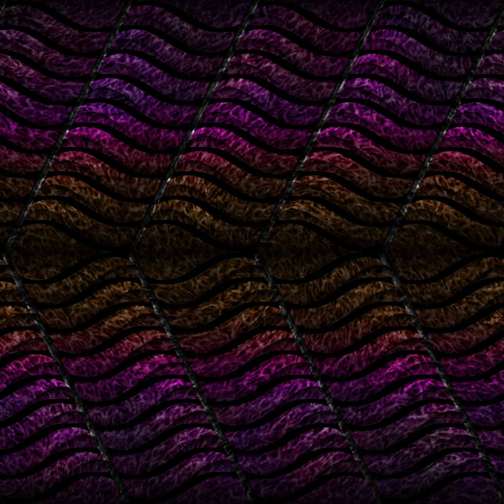
And 26:
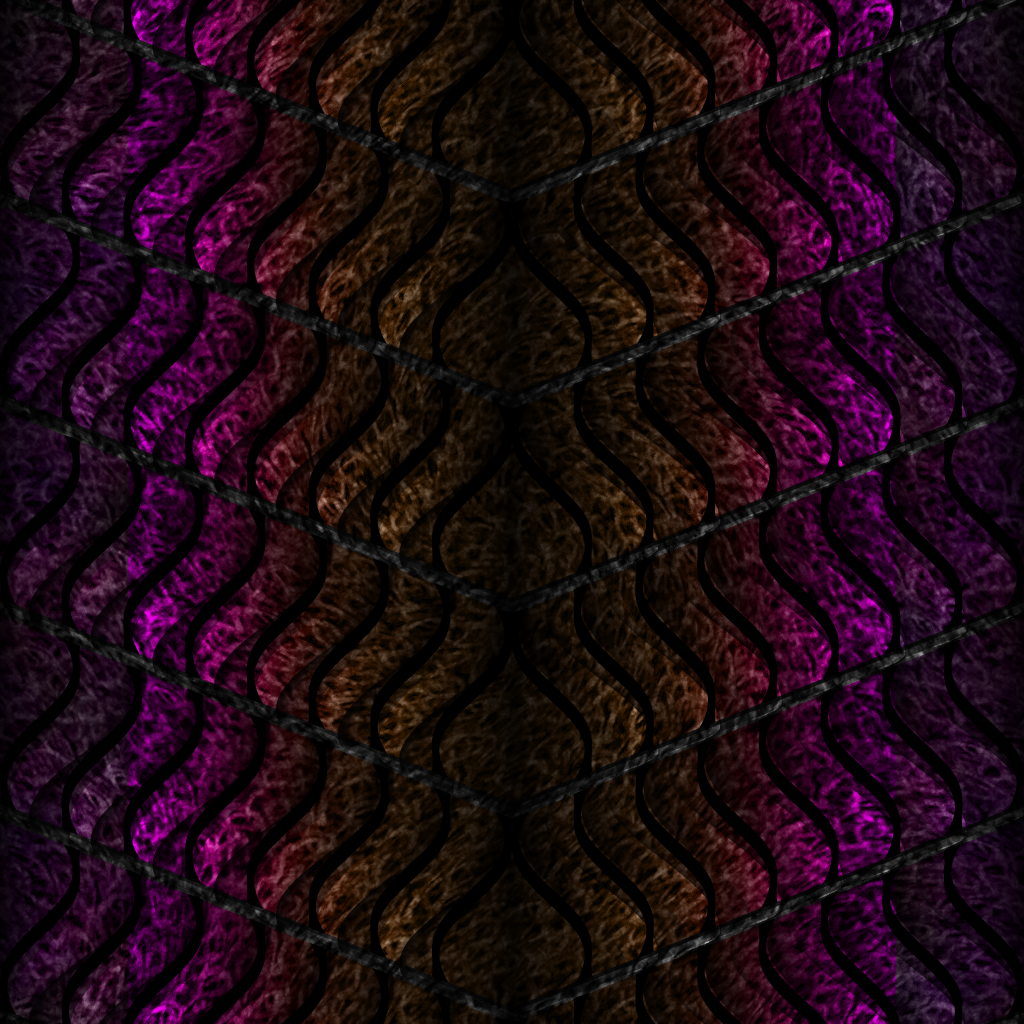
26 is substantially brighter. These differences appear to persist across all four colour variations, and should be made consistent. I personally prefer 33’s colour scheme over 34’s, and likewise 26’s over 25’s. I’m now not confident that other texture pairs don’t have similar colour differences, and would advise checking them all, but these two pairs are really, really obvious. (For instance, 13 seems slightly brighter than 14, but I might just be imagining that one; likewise, 23 seems slightly brighter than 24. I think 35 and 36 are OK, at least! In general, I’d suggest erring on the side of the brighter and more saturated version of each pair – this is a Pfhor collection, after all.) Might be worth checking the other collections when time permits, as well.
Here’s 33 in the purple Pfhor textures:
And here’s 34:
The grating in 33 is substantially more saturated. Likewise, here’s 25:
And 26:
26 is substantially brighter. These differences appear to persist across all four colour variations, and should be made consistent. I personally prefer 33’s colour scheme over 34’s, and likewise 26’s over 25’s. I’m now not confident that other texture pairs don’t have similar colour differences, and would advise checking them all, but these two pairs are really, really obvious. (For instance, 13 seems slightly brighter than 14, but I might just be imagining that one; likewise, 23 seems slightly brighter than 24. I think 35 and 36 are OK, at least! In general, I’d suggest erring on the side of the brighter and more saturated version of each pair – this is a Pfhor collection, after all.) Might be worth checking the other collections when time permits, as well.